Web UI
The flow web subcommand — workflows, jobs, run history, DAG, plus SQL Lab, charts, drag/resize dashboards with cross-filtering, a data-quality view, and RBAC.
Run flow web from any host that can reach your RunLog backend.
The CLI launches a FastAPI server on 127.0.0.1:8080 by default
with no bearer-token requirement on loopback. For off-host access,
pass --token <value>: every /api/* route (except /api/health)
is then gated on Authorization: Bearer <token>. Binding to a
non-loopback address without a token logs a warning.
pip install "ematix-flow[web]"
flow web --port 8080 --module pipelines
# open http://127.0.0.1:8080/
The --module flag (repeatable) pre-imports a pipelines module so
the UI can render schedules, next-run times, and the DAG view
immediately — without waiting for a scheduler tick to populate
rich-history.
The SPA defaults to a dark, focused operator theme — quiet neutral surfaces, a single teal accent for links and active state, and monospace numerics for IDs / timestamps / durations. A theme toggle in the top-right corner of the nav swaps to a light variant; the choice persists across sessions. Eight top-level views: Workflows, Jobs, Runs, and DAG for operating pipelines, plus SQL Lab, Charts, and Dashboards for self-service analytics, and Quality for data-quality checks + freshness SLOs — all on top of a per-run detail page.
Workflows — named groupings with inline DAG
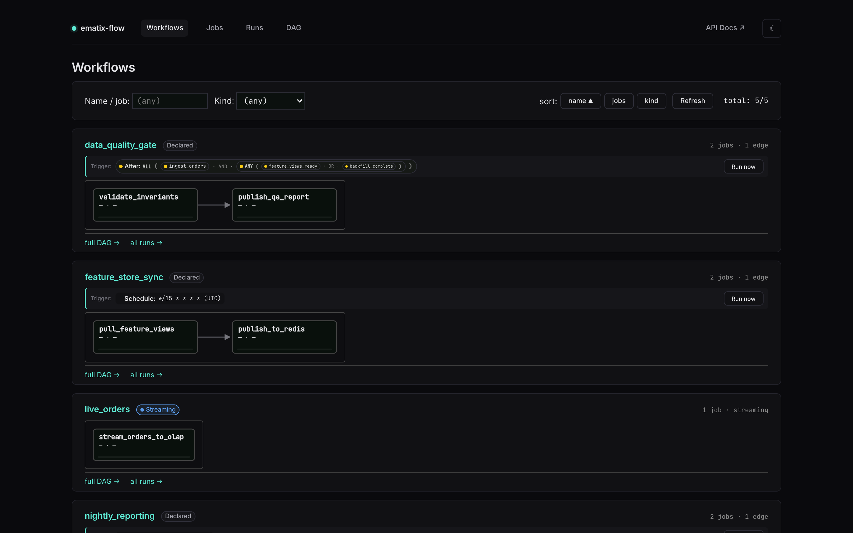
The default landing page is per-workflow. Each card shows the workflow name, a trigger panel (cron / after-expression / on-message), member-job count, edge count, status summary, and an inline SVG flowchart laying out the member jobs left-to-right with arrows on every DAG edge. Reading the example:
data_quality_gatedemonstrates a compositeafter_exprtrigger — the panel renders the expression tree literally:After: ALL ( ● ingest_orders AND ANY ( ● feature_views_ready OR ● backfill_complete ) ). Each leaf carries its own state dot (green = ready, amber = pending, red = failed); composite nodes (ALL/ANY) carry the rolled-up aggregate state. Two-level nesting reads at a glance: the workflow fires afteringest_ordershas finished and either of the two readiness signals is met.feature_store_syncdemonstrates the simple cron case — trigger panel reads “Schedule: */15 * * * * (UTC)”.live_ordersis a streaming workflow — the● Streamingpill (pulsing dot, info-blue) replaces the trigger panel entirely. Streaming workflows don’t fire on a tick; they run continuously.warehouse_etl(below the fold) is a four-job diamond:ingest_ordersandload_dim_customerfan intobuild_sales_mart, which fans out topublish_metrics. The inline flowchart lays it out left-to-right.- Each card carries a kind pill (
Declared/Single/● Streaming), and the header right edge surfaces the job count plus edge count. Status summary pills (N succeeded/N running/N failed) appear inline when relevant. - Click any node in the inline flowchart → focused DAG view
(
#/dag/<job>). Click the workflow title → same.
This view exists to answer “what runs together?” at a glance.
Jobs — every individual job, filtered and sorted
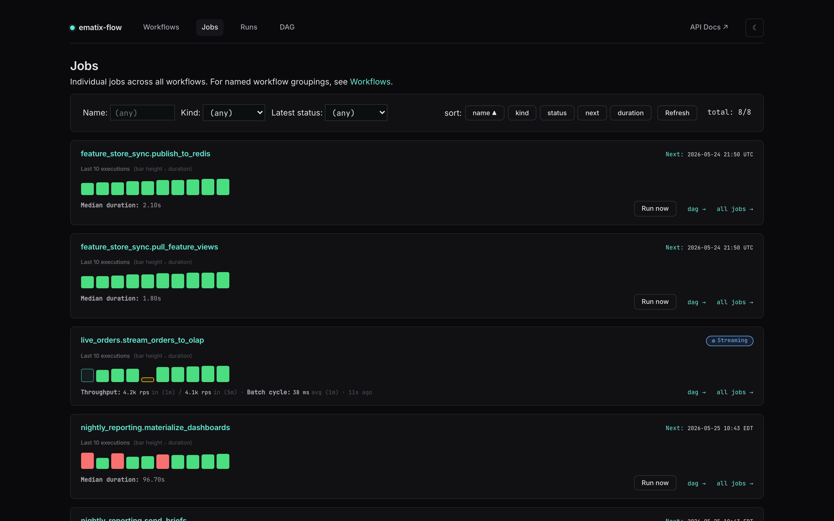
The Jobs tab is the flat list of every individual job in the project — useful when you want to scan one specific job, regardless of which workflow it belongs to. One card per job:
- Name + kind of the job. Names link into the focused DAG view.
- Last-10 execution strip — one colored bar per execution, oldest left → newest right. Green = succeeded, red = failed, teal-pulse = running, amber = paused, dashed = no run yet. Bar height encodes duration with a square-root curve so a single outlier doesn’t flatten the rest of the strip.
- Next:
<UTC>for batch jobs (rendered in the job’s configuredtimezone=when set), or the● Streamingpill for streaming consumers. - For batch: median duration + a link into Runs filtered to that job. For streaming: a live Throughput X rps in (1m) / Y rps in (5m) · Batch cycle: A ms avg (1m) footer.
- Filter inputs (name substring / kind / latest status) and sort buttons (name / kind / status / next / duration) sit in the panel above the cards.
Clicking any square in the last-10 strip drills into that run’s detail page.
Runs — every execution record in a flat table
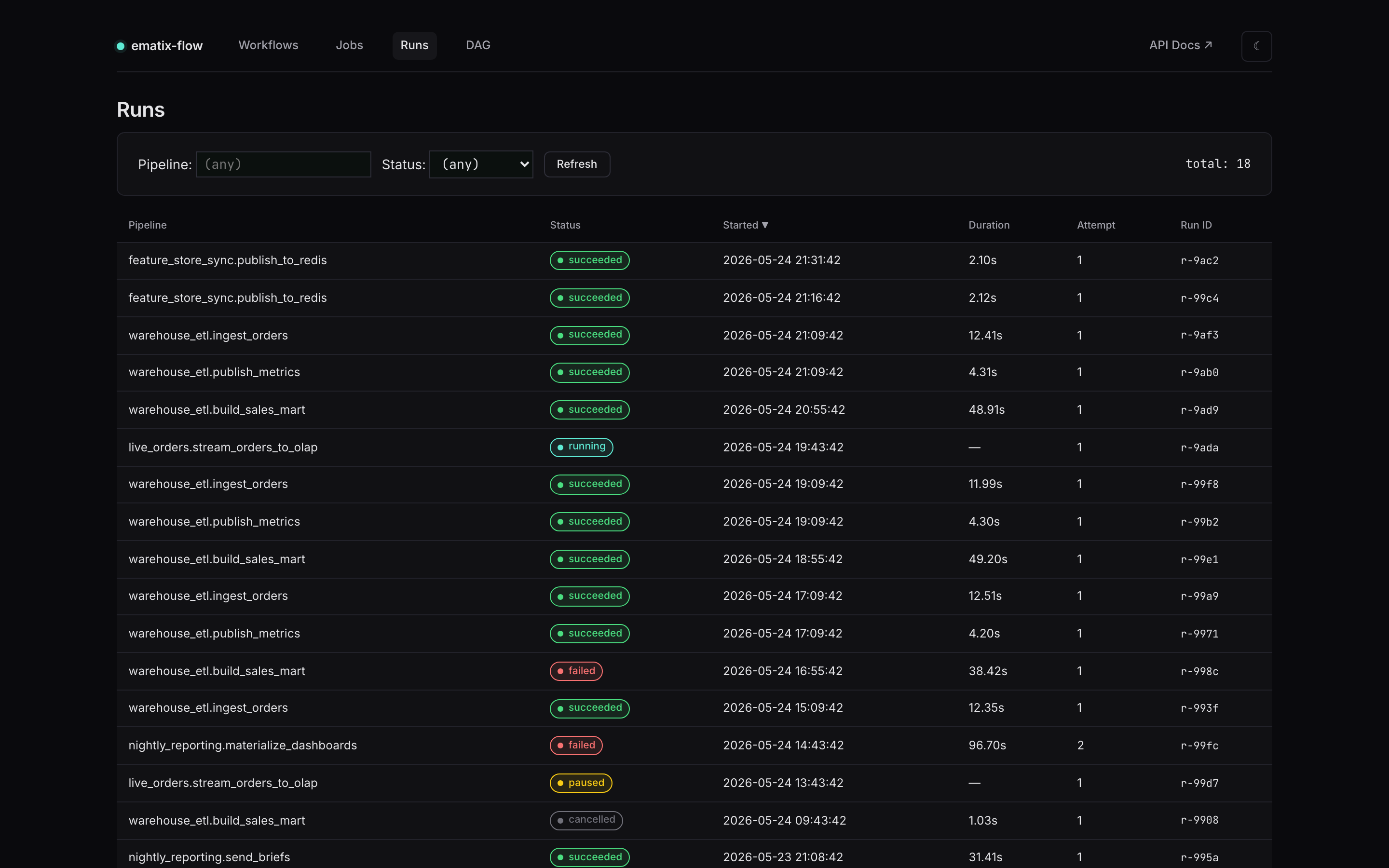
When you need to scan recent failures across every job at once, the
Runs tab is a flat table of every run record. Each row carries
a rounded status pill (● succeeded / ● running / ● failed /
● paused / ● requested / ● cancelled with semantic colors and
a leading dot), the pipeline name, started timestamp, duration,
attempt number, and the run ID. Column headers are clickable to
sort. Clicking a row opens that run’s detail page.
The default sort is Started ▼ (most recent first), which puts
live activity at the top — a ● running row for the streaming job
or a ● requested row for a pending manual rerun stays visible
without scrolling.
DAG — full cross-job flowchart with arrows
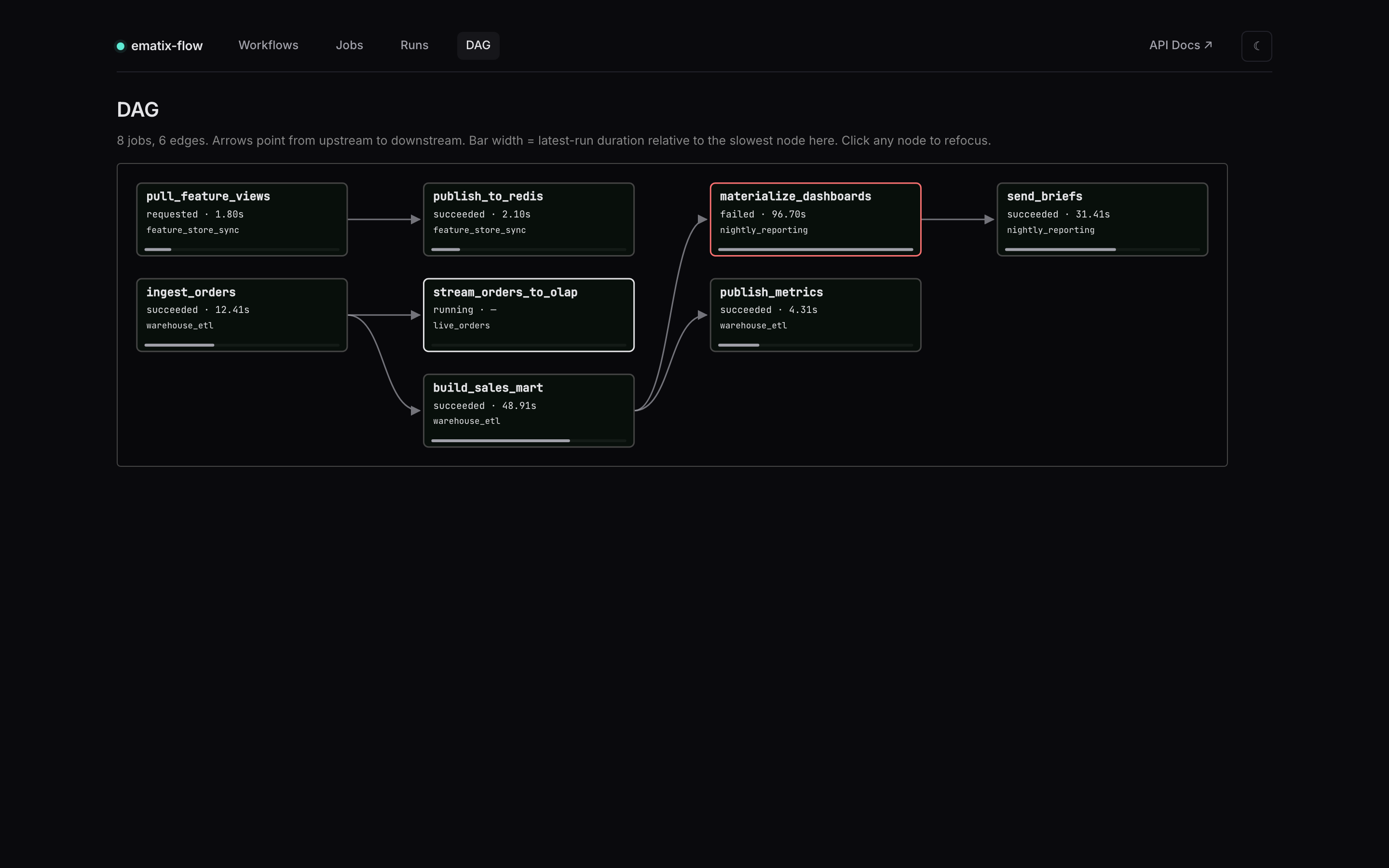
The DAG view (#/dag) renders every dependency edge in the
project as an SVG flowchart with cubic-Bézier arrows pointing from
upstream to downstream. The rank-as-column layout from earlier
versions is gone — topological order is now expressed by arrow
direction, not implied by column position.
Each node shows:
- Leaf name of the job in monospace bold (the qualifying
workflow.prefix is moved off the primary line so long names fit cleanly in the box). - Status · latest-run duration on the next line.
- Workflow prefix as a muted subtitle when the job is qualified
(
warehouse_etl,nightly_reporting, …); jobs that aren’t workflow-scoped fall back to their cron schedule here, and if neither is present the line is omitted. - Duration bar along the bottom edge, sized relative to the slowest node currently visible.
Hover any node to see the fully-qualified name, full schedule, status, and duration in a tooltip.
#/dag/<job-name> focuses the subgraph on a single job’s ancestors
- descendants, so you can answer “what does this job depend on, and what depends on it?” without scanning the full graph.
Failed nodes get a red border with a soft-red background tint. Running nodes get a teal border with a slow pulse animation. Pending nodes get a dashed border in the neutral surface color.
This view is useful for:
- Spotting orphan jobs (no upstream, no downstream — easy to forget when the project grows).
- Catching unintended cycles before they fail at registration time.
- A one-screen answer to “what runs after
ingest_orders?” without grepping decorator kwargs.
Failed run — Restart from failed step highlighted
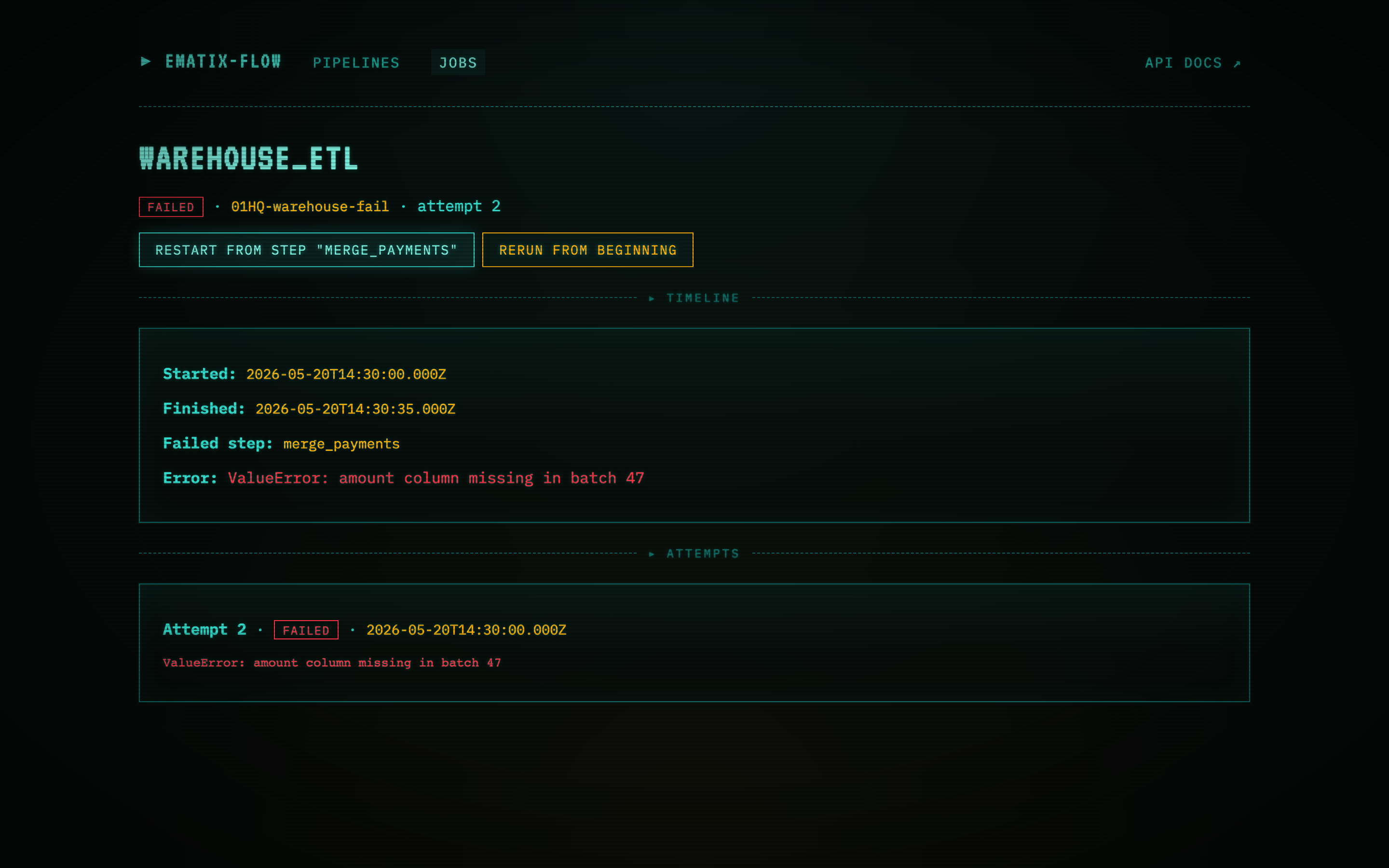
A run that hit an error mid-DAG. The detail page exposes the exact
step that failed (transform_partition_1), the error
(transform_partition_1: ConnectionResetError during shuffle), the
started + finished timestamps, the attempt number, and a Task DAG
panel below with per-step status (succeeded steps in green, the
failed step in red, downstream steps still pending and dashed).
The Restart from step “transform_partition_1” button is one of
two restart actions surfaced on a failed batch run. Clicking it
POSTs to /api/runs/<run_id>/restart with
{ "from_step": "transform_partition_1" }. The scheduler picks up
the new “requested” row on its next tick (default 10s) and the
worker resumes the DAG from transform_partition_1 — earlier
steps’ outputs are reused, so the re-run is the failed step plus
everything downstream, not the whole job.
The Rerun from beginning button next to it (rendered in danger red as the more destructive option) kicks off a fresh run from scratch — useful when the source data has changed or the failure was non-deterministic.
For streaming runs, the same button reads Resume from watermark instead and resumes from the last committed watermark rather than a discrete step. Rerun from beginning is available on any terminated run.
SQL Lab — ad-hoc SQL through the engine
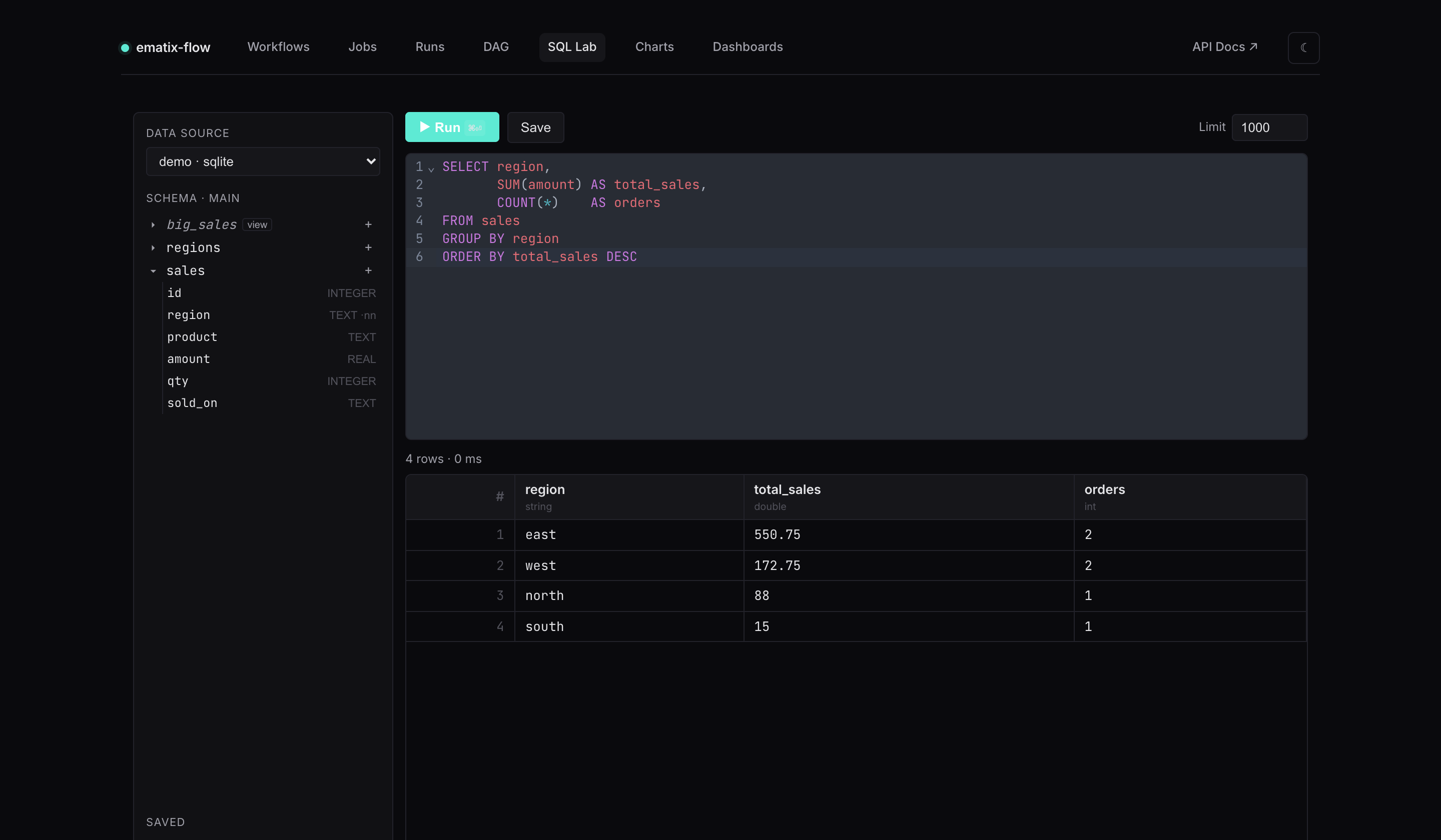
The four operator views sit alongside a self-service analytics surface. Every query runs through ematix’s own engine — Arrow-native, with no pyarrow or pandas in the request path — against data sources you register at launch:
flow web \
  --datasource warehouse=postgres://user:pw@host/db \
  --datasource local=duckdb:///data.duckdb \
  --analytics-db /var/lib/ematix/analytics.db   # persist saved objects
SQL Lab (#/sql) pairs a CodeMirror editor (SQL highlighting +
schema-aware autocomplete) with a live schema browser down the
left — expand a table to see its columns and types, click any name to
insert it. Run with ⌘⏎; results land in a typed grid (each column
tagged string / int / double / …). Name and save queries for
later from the sidebar.
Ad-hoc SQL is read-only by default: only SELECT / WITH /
EXPLAIN statements pass the guard, and engine table-functions that
reach the filesystem or network (read_csv, read_parquet, *_scan,
ATTACH, load_extension, …) are blocked — so a query can’t escape
the sources you registered. A row cap and a per-query wall-clock
timeout bound every run.
Charts — a query becomes a chart
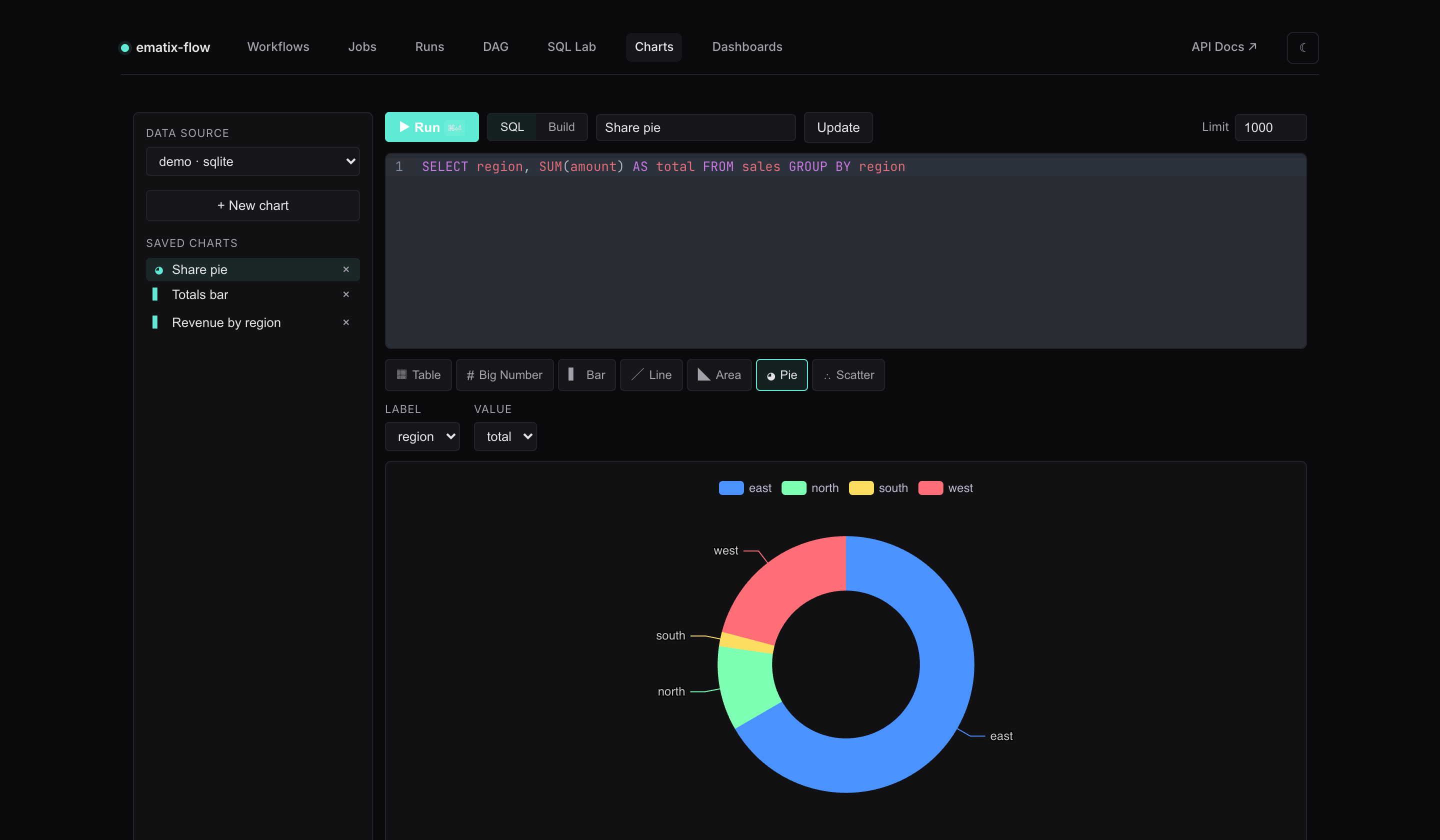
Charts (#/charts) turns a result set into a visualization. Pick a
viz type — table, big number, bar, line, area,
pie, or scatter — then map result columns to encodings
(category, metrics, series). The preview renders live via Apache
ECharts as you change the query or the mapping.
Don’t want to write SQL? Flip the Build toggle: choose a table,
tick dimensions, add metrics with an aggregation (SUM / AVG /
COUNT / MIN / MAX), and the builder generates the GROUP BY
query for you. Charts are saved and become the building blocks for
dashboards.
Dashboards — drag/resize tiles with cross-filtering
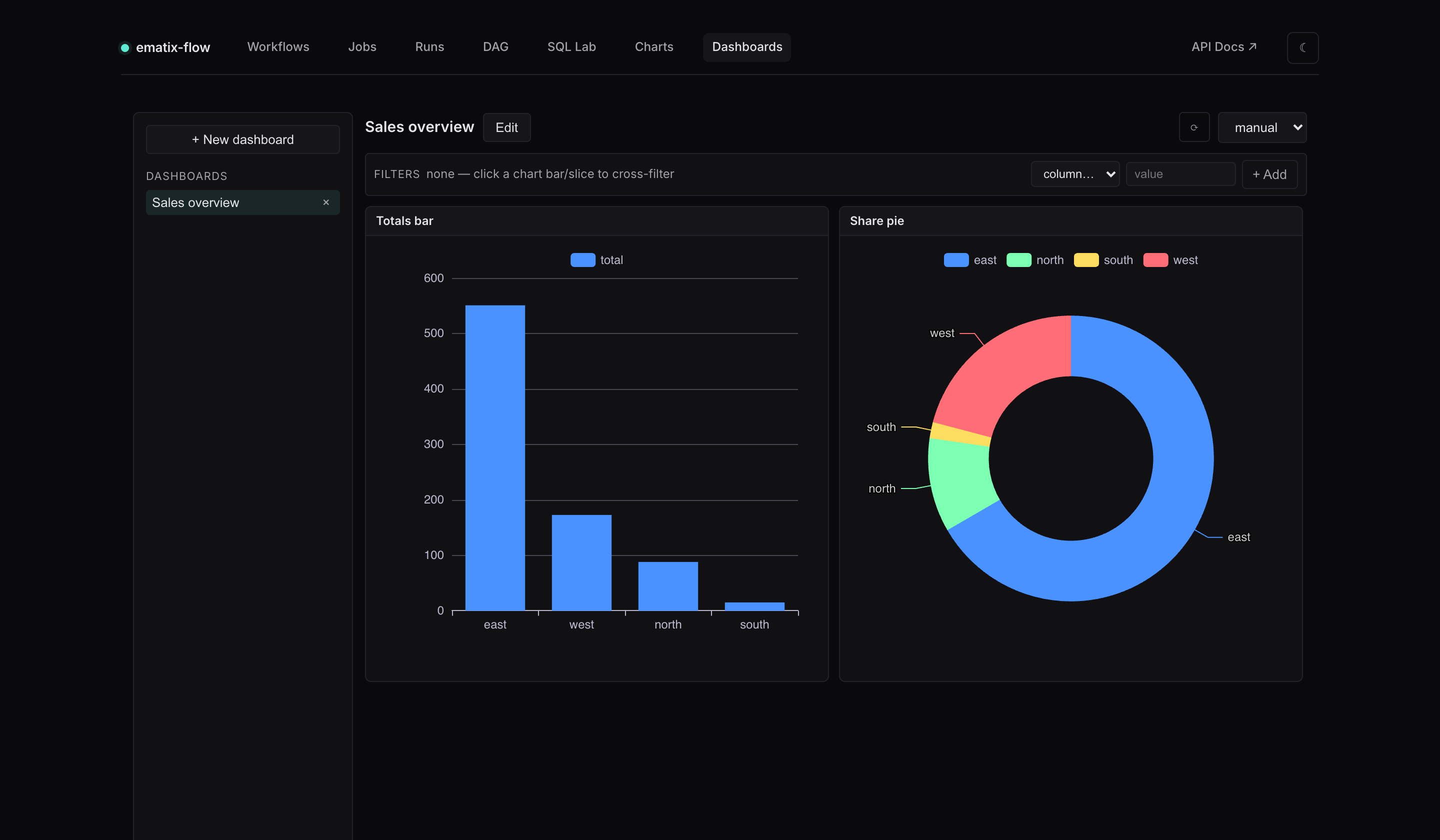
Dashboards (#/dashboards) lay saved charts out on a 12-column
drag/resize grid. Opening a dashboard makes a single batch call
that runs every tile’s query (backed by a short result cache), so a
refresh doesn’t re-run each chart independently.
Click a bar or a pie slice to cross-filter the entire board — the filter chip appears in the filter bar and every tile re-queries scoped to that value; click again (or Clear) to reset. A drill-down modal surfaces the underlying rows behind a clicked point, with a one-click “filter the dashboard by this” action. An optional auto-refresh interval keeps a wall-mounted board current.
Quality — data-quality checks + freshness SLOs
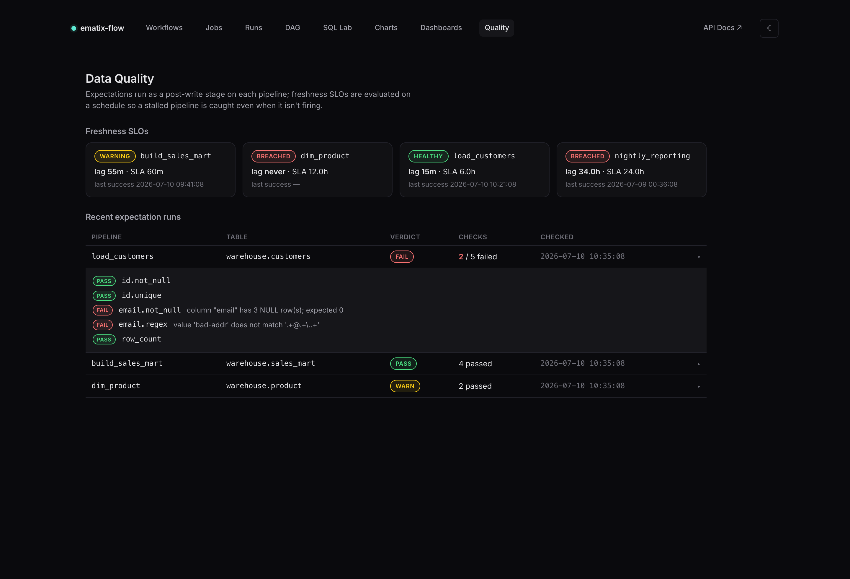
Quality (#/quality) surfaces what the pipelines assert about their
own data. It has two parts:
- Freshness SLOs — one card per pipeline that declares a
freshness_sla=, showinghealthy/warning/breached, the current lag, the SLA window, and the last successful run. Freshness is evaluated on a schedule, so a pipeline that has stopped running still breaches its SLO — a plain failure alert never fires because no run happens. - Recent expectation runs — a row per post-write check with a
pass/warn/failverdict, a failed/total count, and the time checked. Expand a row for the per-assertion detail (eachnot_null/unique/regex/row_count… with the exact violation message).
Checks are declared inline on a pipeline and run through ematix-probe as a SQL-pushdown stage — no data leaves the target database:
@ematix.pipeline(
    target=DimCustomer,                 # PK → unique, NOT NULL → not_null (auto)
    mode="scd2",
    expectations=lambda t: (
        t.column("email").not_null().regex(r".+@.+\..+"),
        t.row_count(at_least=1_000),
    ),
    on_quality_failure="fail",          # "warn" (default) | "fail"
    freshness_sla="6h",
    freshness_column="updated_at",
)
def dim_customer(conn): ...
on_quality_failure="warn" records + alerts but the run still succeeds;
"fail" marks the run failed and skips post-transforms. Breaches and
failures fire through the same Slack / email / PagerDuty alerters as
pipeline failures (quality_failed and sla_breached events). Run
flow freshness-check on a cron to evaluate SLOs continuously:
flow freshness-check --module pipelines \
  --run-log-url postgres://user:pw@host/db \
  --analytics-db /var/lib/ematix/analytics.db \
  --alerter slack://hooks.slack.com/services/T/B/XYZ
Install the extra with pip install "ematix-flow[quality]". It’s fully
opt-in — a pipeline with neither expectations= nor freshness_sla= is
unchanged.
Access control (RBAC)
For shared deployments, front the app with an SSO proxy (oauth2-proxy, Cloudflare Access, an ingress gateway) and let ematix trust the identity header it forwards:
flow web --auth-header x-forwarded-email \
  --auth-group-role analysts=editor \
  --auth-admin [email protected]
Roles gate actions, with objects shared org-wide (owner recorded for attribution): viewer can read dashboards and charts, editor adds running ad-hoc SQL and creating/editing objects, and admin covers everything. A signed-in user’s identity and role show in the top-right of the nav, and controls they can’t use are hidden or disabled. Bind the server to loopback / an internal interface so it is only reachable through the proxy.